Contents
954,410 benefit filings, and what they show about the packages built by medium and large US employers
In the United States, any employer benefit plan with 100 or more participants has to file a public return every year. Smaller plans are usually exempt. That rule means these filings add up to something close to a full picture of what large and mid-sized American employers actually provide.
We analysed all of them for the most recent complete filing year. That is 954,410 filings, covering more than 81 million people, naming 790 insurance groups and $171.5 billion of premium.
Nearly every employer in this data offers health cover. That part is not the interesting bit. The interesting bit is everything else, so we asked:
How complete is the benefits package, and who builds the good ones?
We looked at three things:
- What is in the package, scored the same way for every employer, broken out by sector and by state.
- Which insurers carry the cover, ranked by premium and by the number of people they actually protect.
- Which brokers put these packages together for the country's largest employers.
The answer to the first question turns out to be a story about teeth and paychecks.
The short version
Among employers whose benefit plans have 100 or more participants, here is how often each benefit shows up in the package:
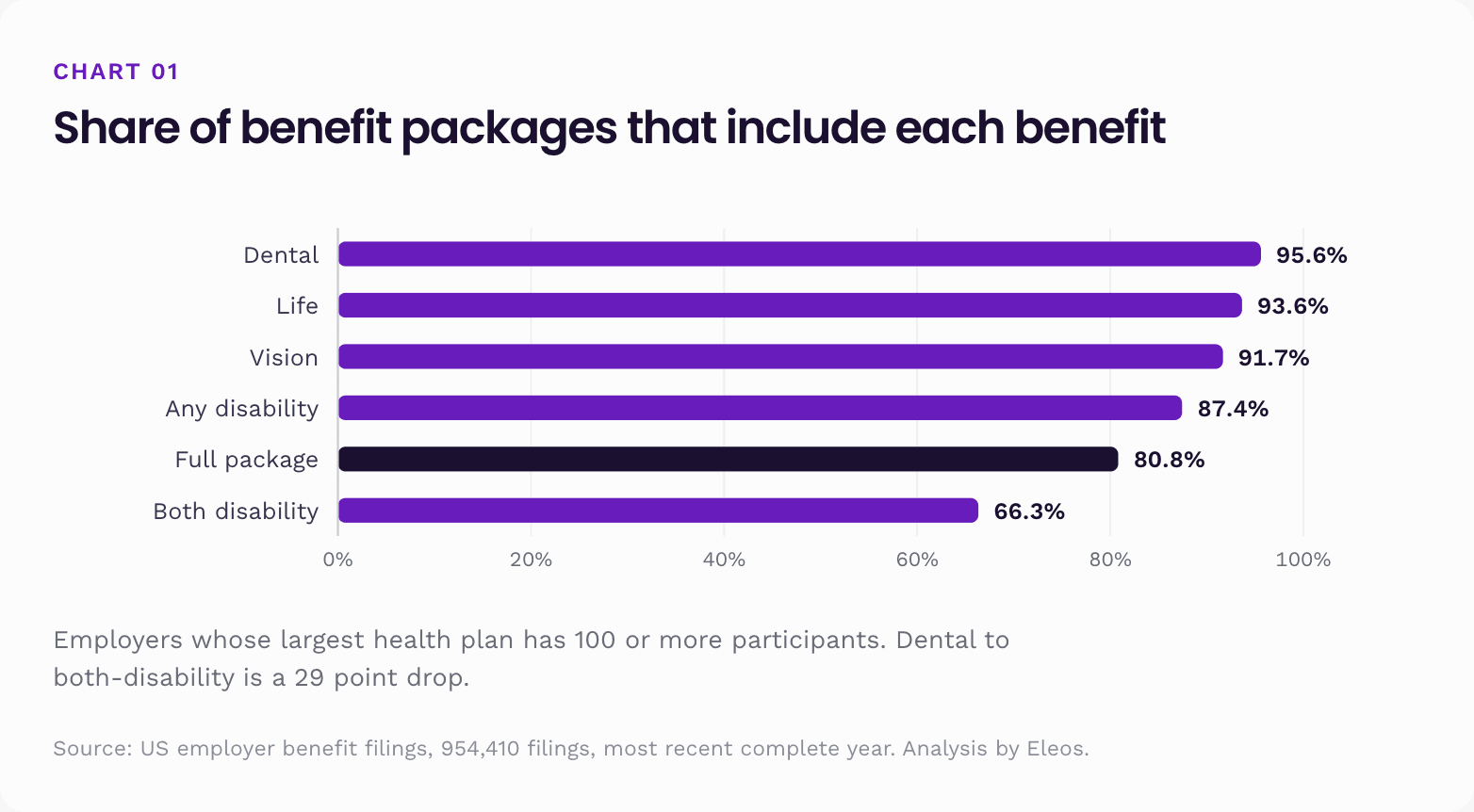
Dental is the benefit employers almost never leave out. Income protection is the one they leave out most. The 29 point gap between those two bars is the biggest single fact in this report, and almost everything that follows is a version of it.
Four more findings:
- 80.8% have the full package: dental, vision, life and at least one disability benefit (95% CI 80.5 to 81.2). Require both disability benefits and it drops to 63.0%.
- Technology leads at 93.5%. Agriculture trails at 59.6%. But that ranking is not about dental. It is almost entirely about life and disability.
- In five states the state provides short-term disability itself, so employers there stop buying it. They record both disability benefits 54.9% of the time against 69.4% elsewhere. Their workers are not uncovered; the cover is simply not the employer's.
- The benefits that go missing are the cheap ones. Dental, life and both disability benefits together have a combined median premium of about $1,267 per covered person per year. Health on its own is $6,347.
One thing to be clear about upfront. These filings show what employers document, not what any one employee actually gets, and none of it measures how good a plan is. The method is at the end, and every percentage comes with a confidence interval.
Part 1. The national picture
Start with the whole country, before cutting it by sector, state or size. This is how often each benefit appears in the package, on the 100 plus base.
| Benefit in the package | 100 plus base | 95% CI | All records |
|---|---|---|---|
| Dental | 95.6% | 95.4 to 95.8 | 67.7% |
| Life | 93.6% | 93.4 to 93.8 | 65.9% |
| Vision | 91.7% | 91.4 to 91.9 | 64.6% |
| Any disability benefit | 87.4% | 87.2 to 87.7 | 61.2% |
| Both disability benefits | 66.3% | 65.9 to 66.7 | 46.1% |
| Full package (dental, vision, life, any disability) | 80.8% | 80.5 to 81.2 | 56.3% |
| Complete package (both disability benefits) | 63.0% | 62.6 to 63.4 | 43.7% |
Now the same question asked about people instead of employers. Every filing reports how many participants it covers, so we can total up the headcount sitting inside plans that include each benefit.
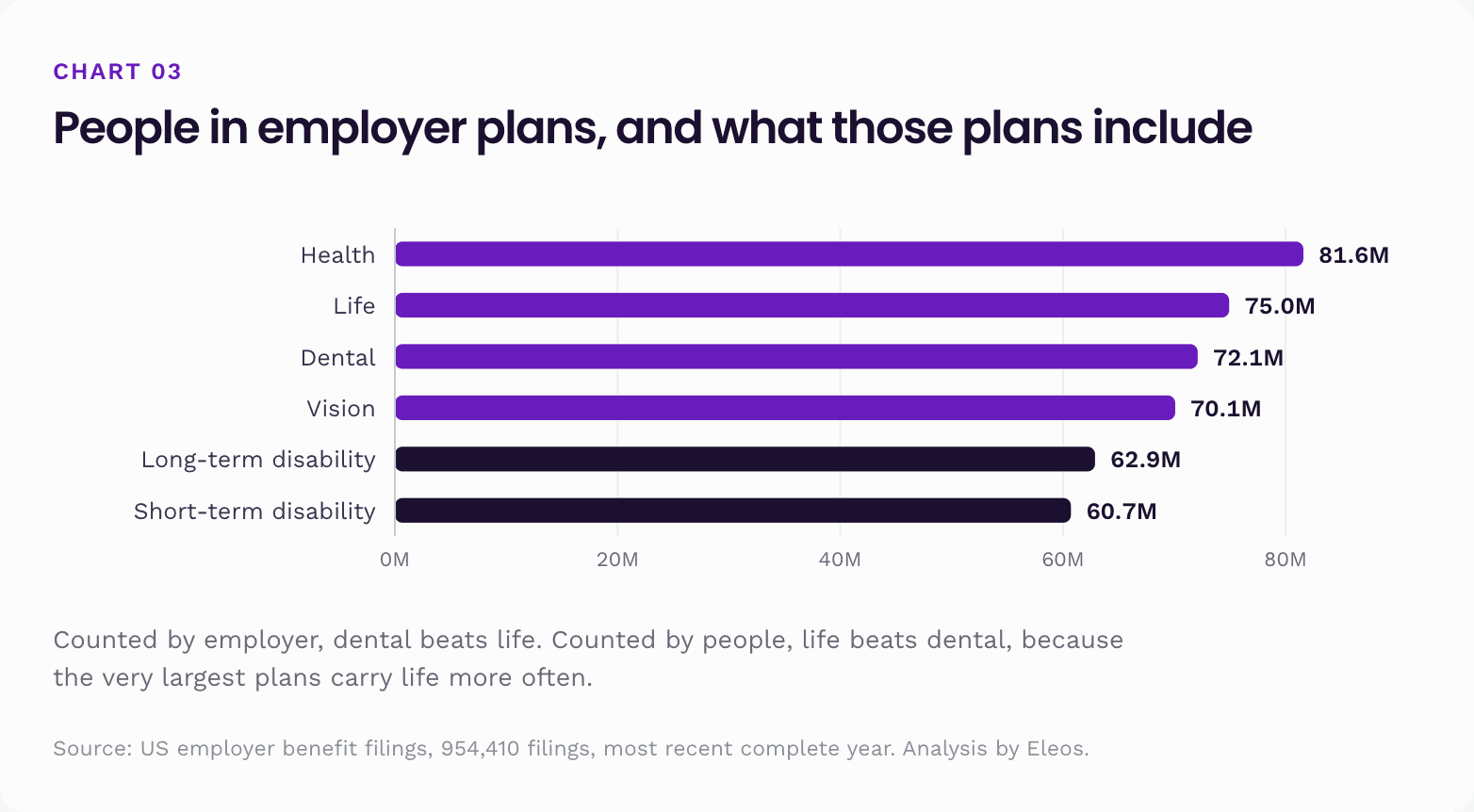
Notice the order changes. Counted by employer, dental beats life. Counted by people, life beats dental. That is because the very biggest plans, the ones with tens of thousands of participants each, are more likely to carry life than dental.
The number that survives both ways of counting: roughly 19 to 21 million people are in an employer plan that includes no disability cover of the matching kind. That is a population about the size of New York State.
What we analysed
The annual return an employer files is not a brochure. It is a compliance document, and it carries three useful things.
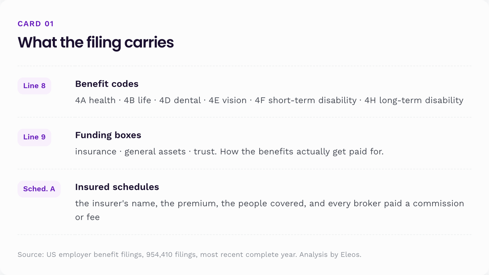
For that year the total is 954,410 filings, of which 949,478 come from the 50 states and DC. Underneath them sit 239,715 insured contract schedules naming 790 insurance groups, carrying $171.5 billion of premium, $4.89 billion of disclosed commission and $1.56 billion of disclosed fees.
We combine each employer's benefit codes across all of its returns, so a benefit filed on a separate form still counts. Then we read every package the same way.
Two things to keep in mind for the rest of this report.
"Documented" is the right word.
A benefit code proves the filing carried it. It does not prove that every employee is eligible or signed up, and a missing code does not prove the benefit is absent. A union trust or a separate entity may file it under its own name. This is a study of documented cover, not of enrolment and not of quality.
Plan size matters more than anything else.
Welfare plans with fewer than 100 participants are generally exempt from filing, as long as they are insured or unfunded. So the small plans that do turn up are unusual: mostly single-benefit trusts that by design record almost nothing else. Every headline number here uses the 100 plus base, meaning employers whose largest health plan has 100 or more participants. We show the all-records number where the contrast is useful.
What the confidence intervals mean here.
Every percentage carries a range, like 80.8% (80.5 to 81.2). How wide that range is depends almost entirely on how many employers sit in the group. Professional services rests on 5,627 employers, so its range is 1.6 points wide. Government rests on 82, so its range is 20.3 points wide, running from 53.8% to 74.1%.
The rule for reading them is one line: if two ranges overlap, you cannot say which group is higher. Technology services (92.3 to 94.6) and information and media (88.2 to 91.2) do not overlap, so technology really is ahead. Wholesale (80.9 to 83.7) and arts and entertainment (79.7 to 84.6) both read 82.3%, but the second is measured far less precisely, and neither can be placed above the other.
That single test does real work in this report. It is why two size bands are described as flat rather than one falling, and why the state cost table shows 20 states instead of 51.
What the range does not cover is anything structural: whether small plans being exempt distorts the picture, whether a benefit is missing because a trust filed it under its own name, whether a code was keyed wrong. Those are larger than sampling noise, and a narrow range says nothing about them.
Here is why that matters, in one picture:
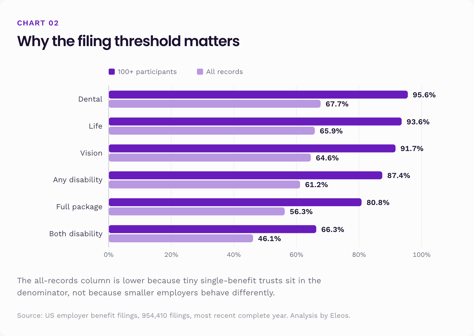
The all-records figures are not evidence that smaller employers do worse. It is evidence that the filing threshold pulls in a strange sample of tiny single-benefit trusts. Anyone quoting a "56% of US employers" figure from this data is quoting an artefact of who has to file.
Part 2. Employee benefits by sector
The national average hides an economy. Each filing carries a business code, and we grouped the 96 detailed codes into 29 recognisable sectors, splitting manufacturing three ways, health care three ways and retail two ways, and keeping technology, hospitals and nursing separate. Every classified employer belongs to exactly one sector, so the whole economy can be read at one level.
Ranked by how often the full package appears, on the 100 plus base:
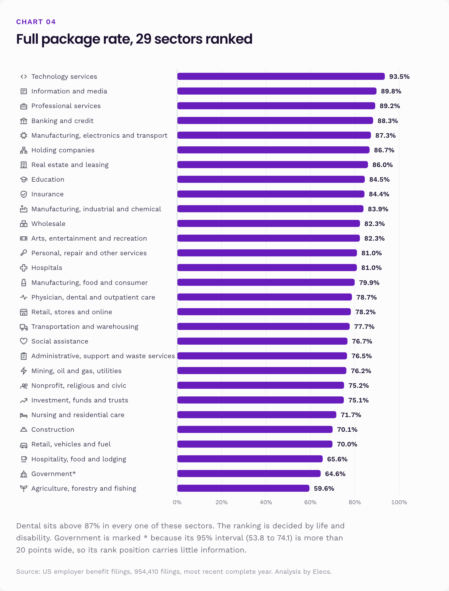
Where two confidence intervals overlap, the difference between those sectors is not established at this sample size. Government is the one sector that should not be ranked at all: its interval runs from 53.8% to 74.1%, over 20 points wide, and most public sector plans sit outside this filing regime entirely, so it describes a small and unrepresentative leftover. Every other sector here rests on at least 563 employers, with an interval under 11 points.
The shape of the underlying data is the finding. Dental barely moves across these sectors: above 87% in every one, above 90% in 28 of 29. Both disability benefits collapse from 88.4% to 43.4%. A 34 point spread in the ranking comes out of a 45 point spread in one benefit and a 1 point spread in another.
Whatever separates a good benefits package from a poor one here, it is not dental.
The same analysis on the detailed business codes, showing the twelve highest and twelve lowest with a workable base.
Highest full package rates
| Industry | Full package (95% CI) | Both disability |
|---|---|---|
| Computer systems design and related services | 93.5% (92.3 to 94.6) | 88.4% |
| Other information services | 93.0% (88.9 to 95.6) | 83.8% |
| Publishing industries (except internet) | 91.2% (88.6 to 93.3) | 82.1% |
| Museums, historical sites and similar institutions | 90.9% (84.8 to 94.7) | 63.6% |
| Architectural, engineering and related services | 90.4% (88.7 to 92.0) | 81.0% |
| Securities, commodity contracts and other financial investments | 90.0% (87.4 to 92.2) | 71.3% |
| Other professional, scientific and technical services | 89.6% (88.5 to 90.7) | 80.7% |
| Computer and electronic product manufacturing | 89.2% (86.4 to 91.5) | 77.0% |
| Legal services | 88.6% (86.4 to 90.5) | 64.4% |
| Data processing services | 88.2% (83.7 to 91.5) | 82.4% |
| Electrical equipment and component manufacturing | 88.1% (84.9 to 90.7) | 75.9% |
| Depository credit intermediation (banks and credit unions) | 87.9% (86.2 to 89.5) | 68.4% |
Lowest full package rates
| Industry | Full package (95% CI) | Both disability |
|---|---|---|
| Nursing and residential care facilities | 71.7% (69.2 to 74.1) | 51.7% |
| Food and beverage stores | 70.1% (65.6 to 74.2) | 49.9% |
| Waste management and remediation services | 69.7% (62.8 to 75.8) | 60.1% |
| Motor vehicle and parts dealers | 69.5% (66.9 to 71.9) | 58.0% |
| Heavy and civil engineering construction | 67.9% (64.3 to 71.4) | 52.4% |
| Specialty trade contractors | 67.4% (65.4 to 69.3) | 48.0% |
| Transit and ground passenger transportation | 65.5% (56.3 to 73.6) | 58.4% |
| Food services and drinking places | 59.9% (56.7 to 63.0) | 46.6% |
| Animal production | 59.4% (51.2 to 67.1) | 43.4% |
| Support activities for agriculture and forestry | 59.3% (51.0 to 67.1) | 43.6% |
| Crop production | 58.2% (51.9 to 64.3) | 42.6% |
| Funds, trusts and other financial vehicles | 50.4% (45.3 to 55.5) | 30.5% |
Two industries need a note rather than a ranking.
Legal services sits near the top at 88.6%, and then has both disability benefits only 64.4% of the time, well below its neighbours. Law firms buy the visible package thoroughly and the income protection pair inconsistently.
Funds, trusts and other financial vehicles comes last, and should mostly not be read as an employer at all. Many of these filers are trusts rather than operating businesses, and a trust often files one benefit under its own name while the rest of the programme is filed somewhere else. The same warning applies, more mildly, to any industry with a lot of union trusts, including parts of construction and transportation.
The widest gap: software against restaurants
The clearest way to see what the ranking actually measures is to put the top industry and one near the bottom side by side. Both are large. Both are real employers with real health plans. Both file the same form.
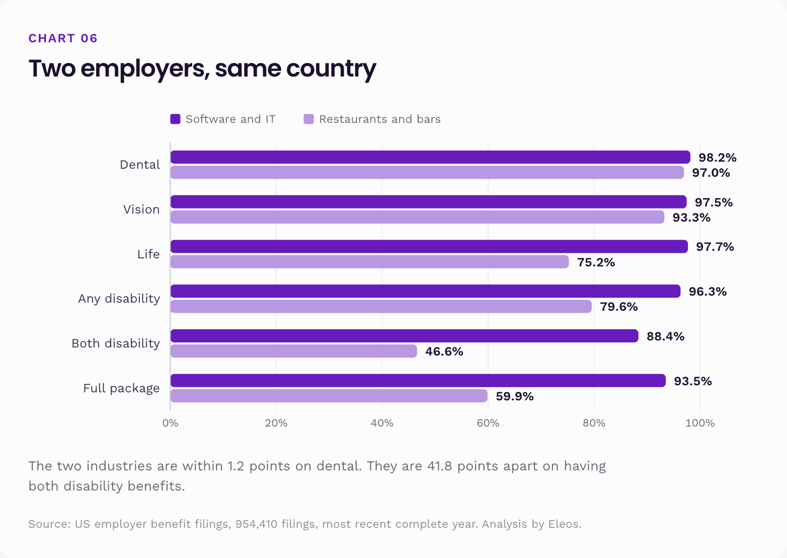
Restaurants have dental within 1.2 points of software companies, and vision within 4.2 points. Then life drops 22.5 points, both disability benefits drop 41.8 points, and the protection gap of +30.2 is the widest of any industry with a workable base.
That is the finding put as plainly as it can be. The benefits a restaurant leaves out are not the ones that clean your teeth. They are the ones that pay when someone dies or cannot work. And the population is not small. Food services alone accounts for roughly 1.26 million people inside filed plans on this base.
A second case is worth naming, because it is less obvious:
Specialty trade contractors, meaning electricians, plumbers, roofers and HVAC crews, have dental 94.3% of the time and life 88.6% of the time. But any disability drops to 77.7% and both benefits to 48.0%. Their protection gap is +15.0. Nationally about 6.4% of the 100 plus base has dental, vision and life but no disability benefit at all. Among specialty trade contractors that share is 13.6%, more than double. These are trades where a back injury ends your earning power, and the paperwork says nothing about it.
Part 3. Employee benefits by state
State here means the address the filing comes from, not where the workforce sits. A Texas headquartered chain with a California workforce counts as Texas. So read these as differences in what gets filed from an address, not as a map of what workers in that state receive.
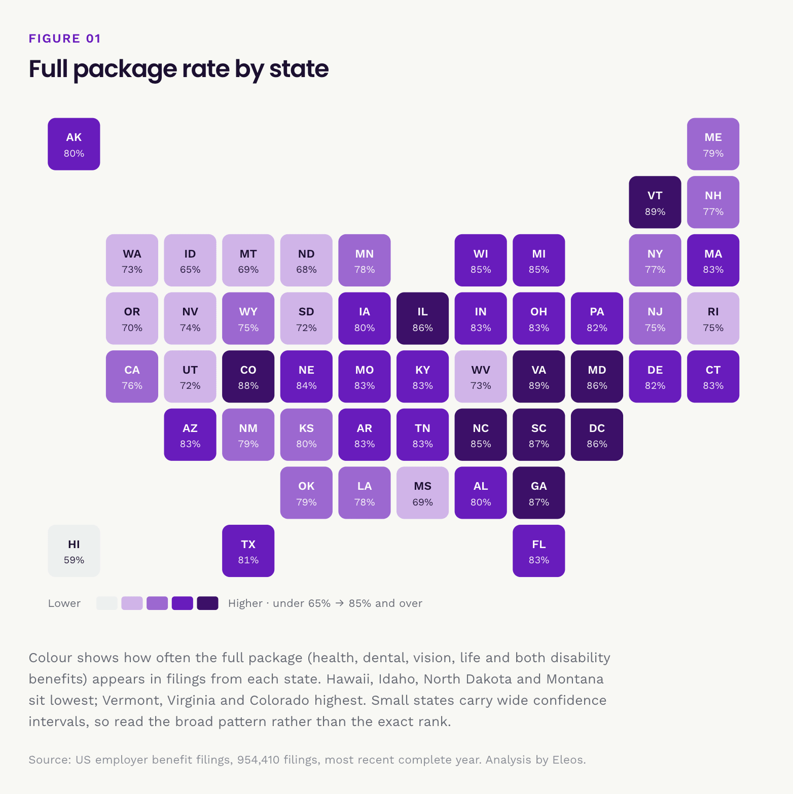
Fifteen of the 51 states have confidence intervals wider than 10 percentage points, and for those the rank position carries no information. Wyoming is the extreme case at nearly 25 points, from 60.6% to 85.4%, which spans almost the whole range of the table. Alaska, Montana, West Virginia, North Dakota, Hawaii, South Dakota, New Mexico, Rhode Island, Delaware, Idaho, Mississippi, Maine, New Hampshire and Vermont are the others. Read those rows only against states whose intervals do not overlap theirs.
The states worth ranking confidently are the large ones, where the interval runs two points or less: California, Texas, New York, Florida, Illinois and Pennsylvania. Treat the fine ordering elsewhere with scepticism and the broad pattern with more confidence.
That broad pattern is odd. Massachusetts and Minnesota, both with strong reputations for employer benefits, sit at 20th and 34th. California, the biggest base in the country, sits at 37th despite having the second highest dental rate of any state. Hawaii is last by a wide margin, on a "both disability" rate of 15.3% that is a third of the next lowest state.
That is not a coincidence, and it is not a story about generosity.
What employer health cover costs, by state
Premium per covered person splits by geography too, and health is the only benefit with enough standalone contracts to survive being cut 51 ways. Even then, only just.
State medians are far shakier than national ones, because each rests on a few hundred contracts rather than ten thousand. So this table carries a screen. A state appears only if it has at least 100 contracts in band and a bootstrapped 95% interval around its median no wider than a fifth of that median. Twenty states clear both tests. The rest are not shown, because their medians move too much under resampling to rank.
| State | Contracts | Median per covered person | 95% confidence interval |
|---|---|---|---|
| New York | 659 | $8,487 | $7,980 to $8,937 |
| New Jersey | 299 | $8,195 | $7,576 to $8,843 |
| Connecticut | 223 | $7,839 | $7,436 to $8,814 |
| Massachusetts | 270 | $7,651 | $7,309 to $8,066 |
| Illinois | 707 | $7,445 | $7,274 to $7,626 |
| Minnesota | 325 | $7,386 | $7,038 to $7,696 |
| California | 954 | $7,351 | $7,174 to $7,507 |
| Washington | 144 | $7,226 | $6,284 to $7,529 |
| Rhode Island | 103 | $6,780 | $6,512 to $7,660 |
| Pennsylvania | 401 | $6,524 | $6,211 to $6,736 |
| Georgia | 284 | $6,404 | $6,103 to $6,730 |
| Ohio | 288 | $6,363 | $5,854 to $6,718 |
| Virginia | 375 | $6,360 | $6,009 to $6,679 |
| Wisconsin | 246 | $6,111 | $5,872 to $6,392 |
| Texas | 706 | $6,007 | $5,823 to $6,235 |
| Florida | 526 | $5,979 | $5,592 to $6,201 |
| Tennessee | 200 | $5,705 | $5,274 to $6,309 |
| Utah | 120 | $5,473 | $5,130 to $6,167 |
| Michigan | 233 | $5,349 | $4,976 to $5,628 |
| Arizona | 163 | $5,277 | $4,881 to $5,838 |
Bootstrap intervals from 4,000 resamples of each state's contracts. Because this screen needs a stated plausibility band ($500 to $30,000 per covered person) to be reproducible, these medians are computed slightly differently from the national $6,347 elsewhere in this report, and the two are not directly comparable. Read this table against itself.
A covered person on a standalone New York health contract costs roughly 1.6 times what one costs in Arizona, and those two intervals are nowhere near overlapping, so that gap is real. Within the middle of the table, though, many neighbouring states have intervals that overlap heavily: Georgia, Ohio and Virginia sit within $50 of one another and cannot be meaningfully ranked against each other.
What is not here matters too. Alabama and New Mexico were in earlier drafts of this table at $1,592 and $3,884. Both fail the screen badly. Alabama's median moves between $1,313 and $2,800 depending on which contracts you resample, an interval 80% as wide as the median itself, and New Mexico's interval is wider than its median. Those were not cheap states. They were unstable numbers, and showing them alongside a caution to ignore them was worse than not showing them.
These standalone contracts also lean toward carve out arrangements, and self-funded employers appear nowhere in them, so this is one slice of the market rather than an all in premium.
The five states where the state pays instead
Most American workers who get sick or hurt outside of work have no automatic wage replacement. Whether you get paid depends on whether your employer bought short-term disability cover.
Five states are different. California, Hawaii, New Jersey, New York and Rhode Island each run their own state disability insurance programme. These are public schemes, funded mostly by payroll deductions, that pay an employee part of their wages while they are too sick or injured to work, for an illness or injury that did not happen on the job. In those five states the short-term protection already exists by law, so an employer there has little reason to buy and file a separate short-term disability benefit.
Here is where each of those five ranks nationally for having both disability benefits, out of 51:
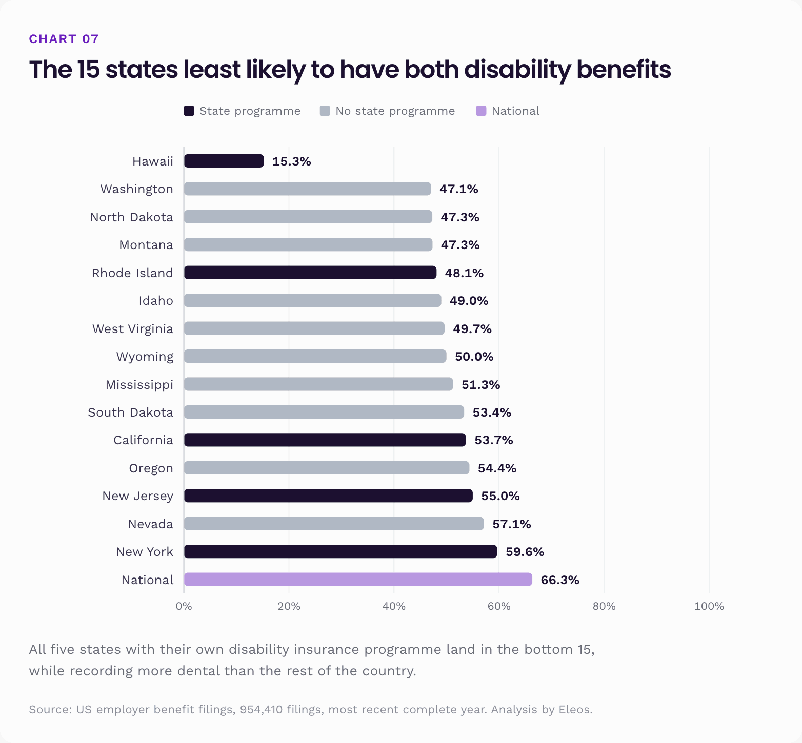
All five land in the bottom 15. Pooled together they have both disability benefits 54.9% of the time, against 69.4% in the other 46 jurisdictions. That is a 14.5 point difference.
It is worth being clear about what that ranking measures, because it reads backwards at first glance. It is about the employer's paperwork, not the worker's protection. An employer in California has little reason to buy short-term disability when the state already provides it, so its filing records long-term disability alone and fails a test that asks for both. The employee still has short-term cover. It is just not coming from their employer. Whether the state benefit is as generous as a private one is a separate question, and not one these filings can answer.
The obvious rival explanation is that these are simply states where employers file less of everything. The data rules that out:
| Benefit | The five state programme states | Everywhere else |
|---|---|---|
| Dental | 96.6% | 95.3% |
| Life | 92.6% | 93.9% |
| Any disability | 80.6% | 89.3% |
| Both disability benefits | 54.9% | 69.4% |
Employers in those five states have dental more often than the rest of the country, and life at essentially the same rate. The shortfall is specific, and it lands exactly where a public programme already sits.
This changes how the whole report should be read. Part of the national disability gap is a public programme doing its job, not employers withholding cover. A California employee has state disability insurance whether or not their employer's filing mentions it. Washington and Oregon show up nearby on the same chart, and both introduced paid family and medical leave programmes in recent years. Those are not identical schemes, but they point the same way.
The flip side is sharper. In the other 46 jurisdictions, the 30.6% of employers without both disability benefits have no public programme standing behind them. There, the missing benefit is simply missing.
Part 4. Employee benefits by plan size
Sector and geography both matter, but neither matters as much as something cruder: how many people are in the plan. The full package rate climbs steeply out of the smallest filings, and then stops climbing.
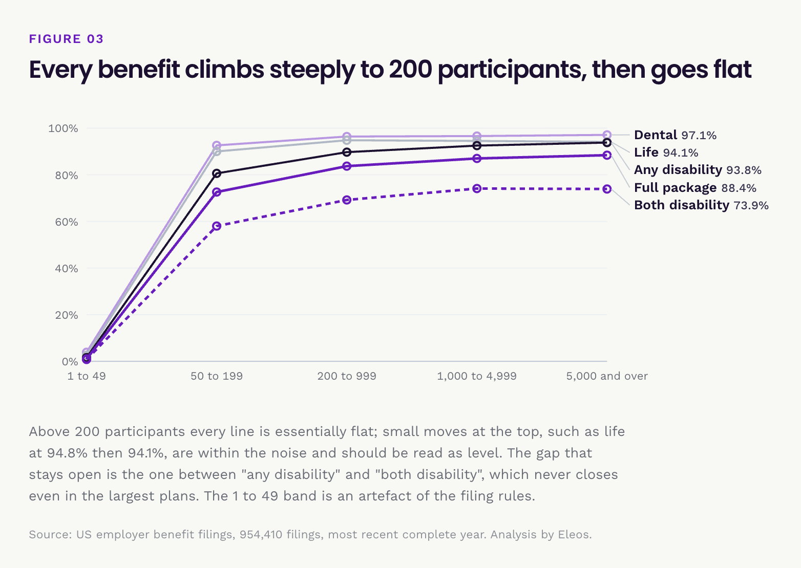
Three things to take from this.
The 1.0% is an artefact, not a description of small business. Small welfare plans are generally exempt from filing unless a benefit is funded through a trust. So the tiny plans that show up are single-benefit trusts that by design record nothing else. Any statistic that mixes this band with the others is measuring the filing rules.
Above 200 participants the curve flattens fast. Going from 200 to 5,000 plus buys only 4.7 extra points of full package. Both disability benefits reads 74.1% in the 1,000 to 4,999 band and 73.9% at 5,000 and over, but those two intervals overlap, so the apparent dip at the top is not established. Read the top of the table as flat, not as a decline. Scale stops helping quite early: a 250 person employer already behaves a lot like a 25,000 person one.
One number does not behave. The share with an insurer named on the health benefit falls with size exactly as you would expect, 68.7% then 60.1% then 50.0%, and then jumps back to 66.1% at 5,000 and over. That reversal is real rather than noise: the two intervals do not overlap.
The rest of the funding data explains it. Paying benefits from insurance alone falls straight through the bands without a wobble: 38.0%, 23.5%, 7.7%, then 4.1%. Payment from the employer's own money is flat at 82.4% across the top two bands. So the largest employers have not started buying insurance again. They have added insured pieces on top of a self-funded core: a fully insured HMO option in one region, a carved-out ancillary line, a single-state contract. An employer with 50,000 people can self-fund its main medical plan and still name three insurers on its filings. Multiemployer arrangements, which buy their insurance through a trust, also rise steeply with size, from 3.2% of the 200 to 999 band to 12.0% at the top.
Most of the people are at the top. The 5,000 plus band holds 45.2 million of the roughly 72 million people on this base, which is 63% of the population inside a small share of the filings. That is why the headcount table earlier looks different from the percentage table. National percentages describe organisations, but most workers sit inside the biggest ones.
Self-funded vs fully insured: who carries the risk
Every filing has checkboxes for how the plan's benefits get paid: through insurance, out of the employer's own money, through a trust, or some combination.
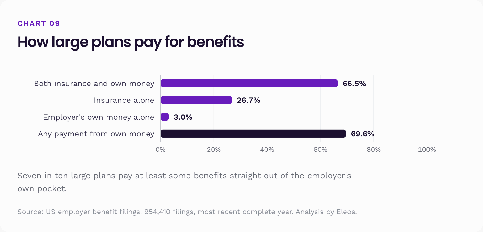
Seven in ten large plans pay at least some benefits straight out of the employer's own pocket. The checkboxes describe the whole plan, which usually bundles several benefits together, so "both" normally means a self-funded medical benefit sitting next to insured extras, rather than a mix inside medical itself.
Split by benefit, using the absence of any named insurer as the signal:
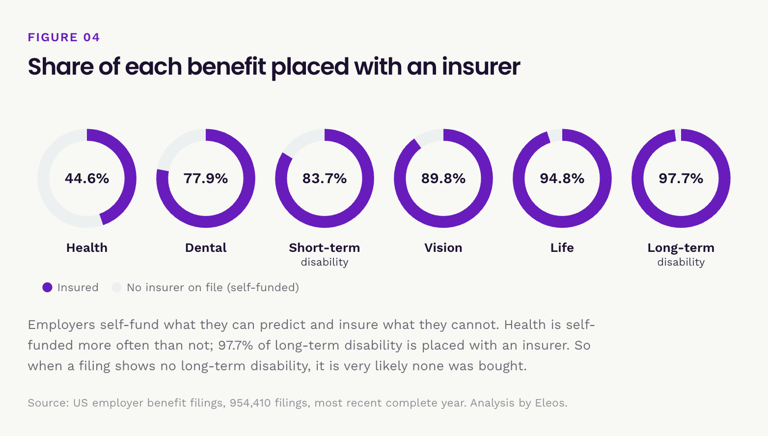
This is almost a perfect mirror image of the reliability ladder, and it explains a lot.
Employers self-fund what they can predict, and buy insurance for what they cannot.
Health claims are frequent and statistically well behaved, so at scale they are cheaper to pay directly than to insure. Long-term disability claims are rare, individually enormous, and can run for decades. Almost nobody self-funds them. 97.7% of long-term disability is placed with an insurer.
That has an important consequence for this report. The disability gap is a buying gap, not an accounting one. When a filing shows no long-term disability, it is very likely that no cover was bought, because if it existed an insurer would be named. The same reasoning is much weaker for health, where a missing insurer usually just means the employer pays claims itself.
Part 5. The protection gap
This is the measure we found most useful, and it is the organising idea of the whole report.
Split the five non-health benefits into two families:
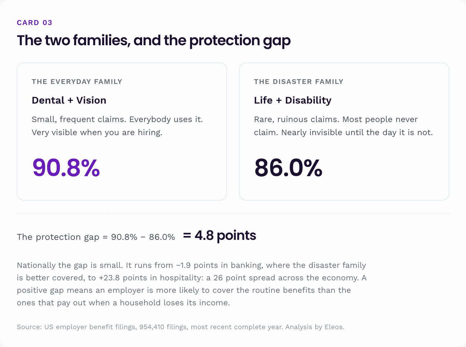
Nationally the gap is small. That average hides almost everything interesting, because the gap runs from −1.9 points in banking, where the disaster family is actually better covered, all the way to +23.8 points in hospitality. That is a 26 point spread across the economy.
A positive gap means an employer is more likely to cover the routine, low-stakes benefits than the ones that pay out when a household loses its income. It is the cleanest single signal in this data of what kind of benefits programme an organisation is running.
Which industries skip life and disability cover
The same 29 sectors, ranked by the protection gap. This shows how much more reliably each one covers the everyday family, dental and vision, than the disaster family, life and disability.
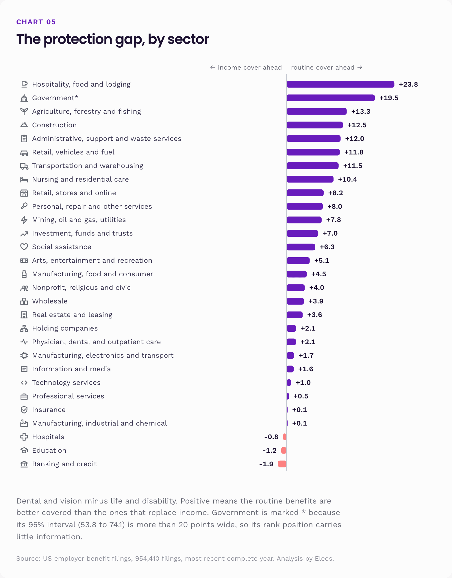
Three things stand out.
The gap tracks physical risk backwards. Construction (+12.5), transportation (+11.5), agriculture (+13.3) and nursing care (+10.4) are among the most injury prone parts of the economy. They are also the sectors least likely to have income protection relative to routine cover. The places where a body is most likely to stop working are the places least likely to have written down what happens when it does.
Three sectors run the other way. Banking, education and hospitals cover life and disability more reliably than dental and vision. All three have long tenure, formal HR departments, and in banking's case an unusually literal understanding of what income replacement is for.
The bottom of the chart is not just "rich employers". Insurance carriers and industrial manufacturers both sit at +0.1, almost perfectly balanced, and neither is a high margin technology business. Balance looks like a function of how professional the benefits function is, not how much money is lying around.
Where the disability ladder breaks
Rank the six benefits by how reliably they show up and you get a ladder rather than a random scatter. The same ladder repeats in almost every sector, state and size band we looked at.
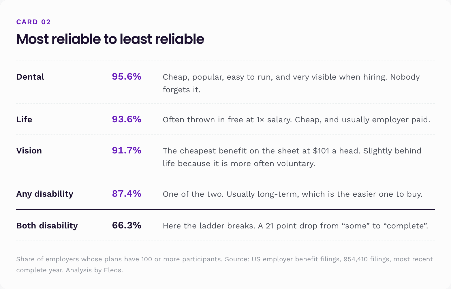
That 21 point step from "any disability" to "both disability" is where the real gap lives. It is not that employers refuse income protection. 87.4% have something. It is that the protection is usually only half built. Short-term disability covers the first weeks or months of an illness. Long-term disability picks up after that. One without the other leaves a hole somewhere in the timeline.
The size of the step varies a lot by sector:
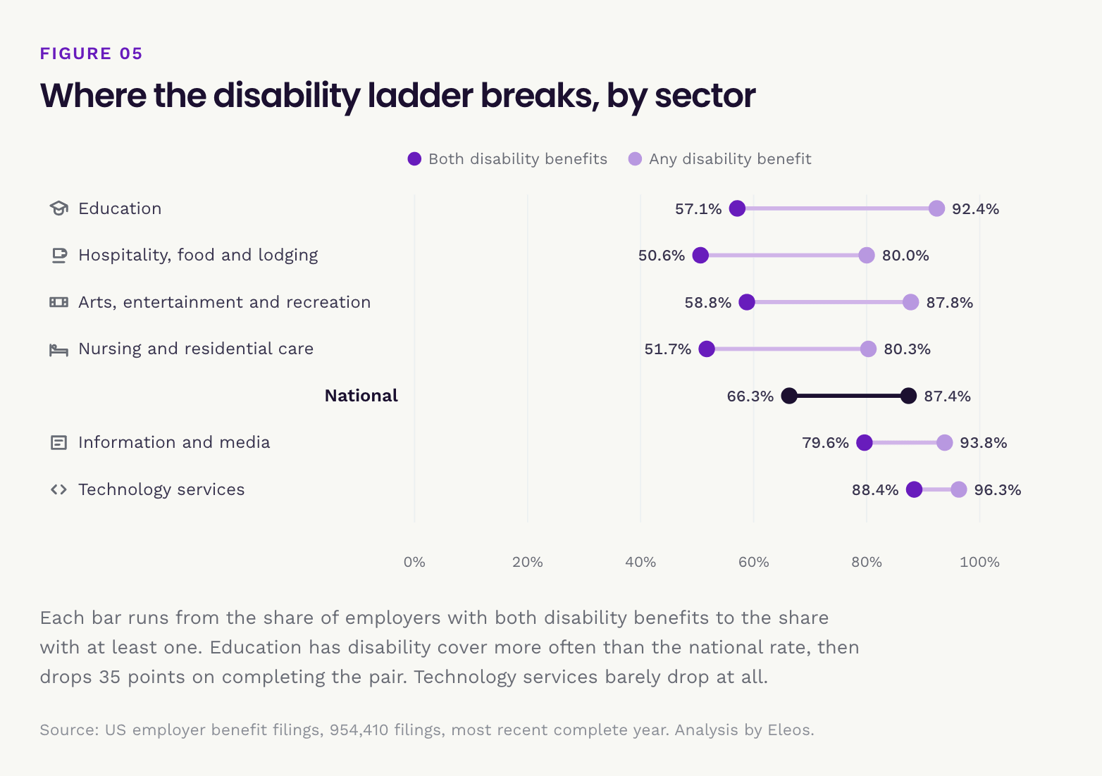
Education is the extreme case, and a useful one. Schools and colleges have disability cover 92.4% of the time, better than the national rate. Then only 57.1% have both kinds. In practice that usually means long-term disability plus a sick leave bank or accrued leave standing in for the short-term piece. That is a real benefit, but a benefit code cannot see it. Technology, at the other end, buys the pair about as often as it buys anything.
Does price explain the order?
The obvious explanation for the ladder is cost: employers buy the cheap benefits and skip the dear ones. The filings say otherwise.
Line the five extras up by what they cost against how often they appear:
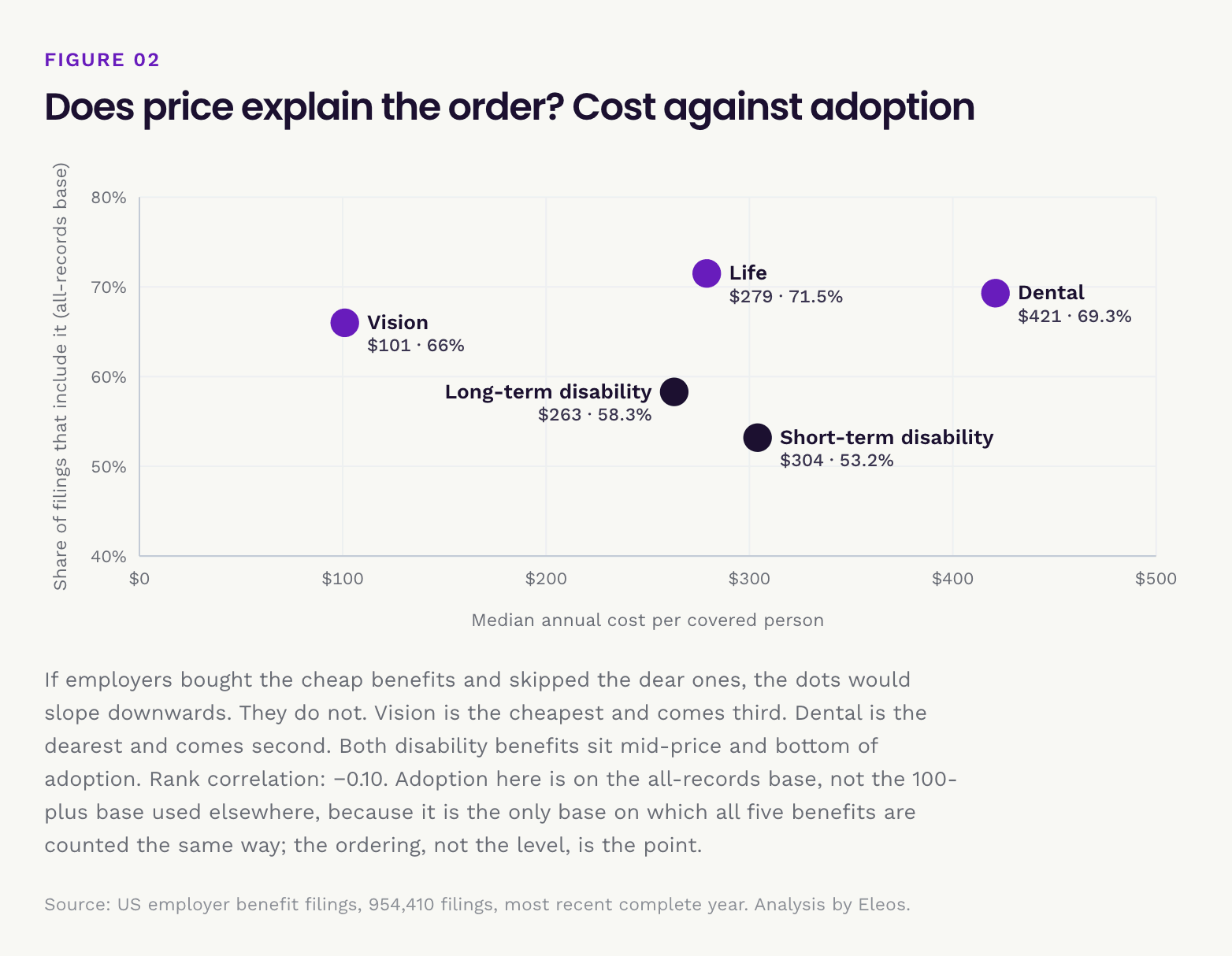
The rank correlation between cost and adoption is −0.10, which is another way of saying price tells you essentially nothing about whether an employer buys the benefit. The cheapest of the five, vision at $101, comes third. The dearest, dental at $421, comes second. The two disability benefits are the middle of the price range and the bottom of the adoption range.
If cost were driving these decisions the two would line up, and they do not.
What does line up is how often an employee notices the benefit. Dental gets used twice a year by nearly everybody. Vision produces a pair of glasses. Life pays once, to somebody else, and is usually handed over free at one times salary, which is why it leads on adoption despite being invisible in day-to-day use: it costs the employer little and asks the employee nothing. Disability pays to a small minority, after a waiting period, through a process most employees have never thought about.
That also explains the one ordering that looks odd. Life at 71.5% beats vision at 66.0% even though vision costs a third as much, because vision is more often voluntary and employee-paid, so some employers never file it as a plan benefit at all, while basic life is an employer-paid default.
Adoption here is measured on the all-records base rather than the 100-plus base, because it is the only base on which each of the five benefits is counted the same way. The ordering, not the level, is the point.
Why an employer would buy both, and who does
The two benefits are designed to dovetail. A long-term policy's waiting period is normally set to end exactly where the short-term one runs out, so the pair is really one product sold in two pieces. Buy only long-term and there is an unpaid gap between the day sick leave runs out and the day the policy starts, which is the stretch most people actually hit. Buy only short-term and the money stops after six months, which is the case that ruins a household.
Completing the pair is also cheap. The two together have a combined median premium of about $567 per covered person a year, roughly 9% of the median health benefit sitting next to them on the same renewal.
When an employer records only one of the two, it is usually the long-term half: of the employers on this base with exactly one disability benefit on file, about two in three carry long-term rather than short-term. That fits the economics. Long-term is the loss a household cannot absorb, and, as the pricing above shows, it is the cheaper of the two to buy.
Two cautions before reading a single benefit as a gap. 16.3% of short-term disability is self-funded, so an employer with no short-term code may still be running salary continuation or a sick-pay scheme out of its own pocket. And in California, Hawaii, New Jersey, New York and Rhode Island the state provides that half already.
Who does buy both. Among the largest employers in the filings, the pair is close to standard. Walmart, Target, General Motors, UPS, Home Depot, Lowe's, JPMorgan Chase, AT&T, CVS, Wells Fargo, RTX, UnitedHealth Group, Walgreens, HCA and Kroger all record both. So does Compass Group, the catering and food-service employer, which matters because food services is the industry that ranks worst in this whole report. A weak sector rate is a pattern, not a destiny.
Narrow to employers with 1,000 or more participants and the sectors that most often complete the pair are computer systems design (91.6%), real estate (91.0%) and architectural and engineering services (87.3%).
Employers are named here only for benefits their own filings record. The counts in this subsection come from a direct query of the filings rather than from the summary tables, so they sit on a very slightly different base than the headline percentages; the ordering, not the decimal, is the point.
What short-term and long-term disability cost
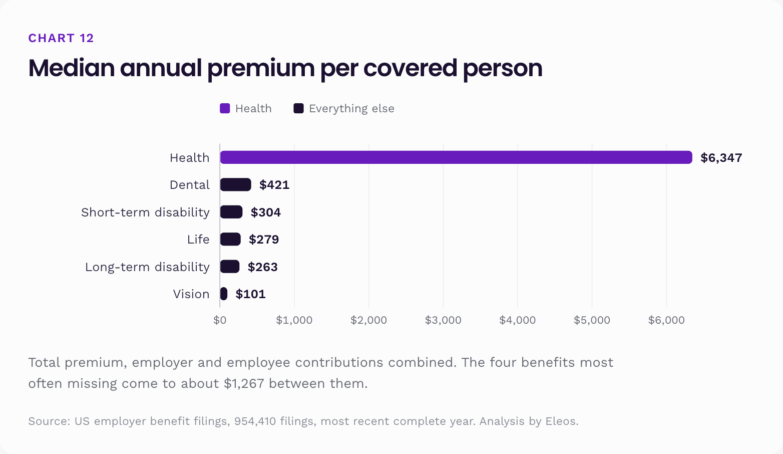
For contracts that cover a single benefit, premium divided by the number of people covered gives an annual cost per covered person. These are medians, after dropping implausible rows:
What these numbers are, exactly
This is worth spelling out, because it is easy to read them as something they are not.
These are total premiums, not payroll deductions. The figure combines what the employer pays and what the employee pays. It is the whole cost of the benefit, not the line on a payslip. An employee's own share of a $421 dental benefit is typically a fraction of that.
The denominator is people covered on that contract, as the carrier reported it. It is not employees, and it is not households. We checked how that number compares with the plan's participant count on the same filing. The median ratio comes out close to one: 0.77 for health, 1.00 for dental, 0.84 for vision, 0.88 for life, 0.90 for long-term disability and 0.61 for short-term disability.
That tells us two useful things. First, these are not household inflated figures. If they routinely counted a spouse and two children against one employee, the ratio would sit near 2 or 3, and it does not. So $6,347 behaves much more like a per person cost than a per family cost.
Second, the spread is wide. The middle half of health contracts runs from 0.29 to 1.17 people covered per plan participant. That is because a single contract often covers only part of a plan: one region, one class of employee, or a carved out benefit. So treat these as good indicators of what a benefit costs per person, and not as a precise per employee budget line.
We cannot split employee from spouse from child. The filings do not carry that breakdown. If your health plan covers your spouse, that spouse is somewhere in these numbers, but the data does not say where.
These are insured contracts only, and that cuts unevenly. A benefit appears here only when an insurer was named. Because 55.4% of health benefits are self-funded, more than half the health market is invisible to these figures, so $6,347 describes the insured slice rather than the whole. The extras have no such problem: 97.7% of long-term disability and 94.8% of life are insured, so those figures cover nearly the entire market. The comparison between health and the extras is therefore a partial picture of one set against a near-complete picture of the other, and we cannot tell from these filings which way that biases the gap.
Why long-term disability costs less than short-term
There is an oddity worth stopping on. Long-term disability covers a far bigger loss than short-term disability, sometimes decades of lost earnings against a few months, and it costs less: $263 against $304.
The reason is that premium tracks how often a benefit pays, not how much it pays when it does.
The waiting period does the work. Long-term disability usually does not start until you have been continuously unable to work for 90 or 180 days. Most disabilities resolve well before that: a surgery recovery, a back injury, a difficult pregnancy, a stretch of poor mental health. The waiting period acts as an enormous deductible that filters out almost every claim before the insurer pays anything. Short-term disability has almost no deductible. It waits a few days, then pays.
So short-term disability is high frequency and low severity, and long-term disability is low frequency and high severity. On price, frequency wins.
Two other things hold the long-term price down. Benefits are usually reduced by whatever the claimant receives from Social Security Disability, workers' compensation or a state programme, so the insurer's net liability on a long claim sits well below the headline share of salary. And most policies tighten their definition at 24 months, from being unable to do your own job to being unable to do any job, which ends a large share of claims that get that far.
Two things in these filings support that reading. The first is the funding split. 16.3% of short-term disability has no insurer on file, against 2.3% of long-term. Employers keep short-term disability on their own books about seven times as often, because it is frequent and predictable, which is exactly the risk a business can carry itself. Almost nobody keeps long-term disability, because one claim can run for decades.
The second is the shape of the distributions. Compare each median with its average:
| Benefit | Median | Average | Average ÷ median |
|---|---|---|---|
| Health | $6,347 | $6,877 | 1.08 |
| Dental | $421 | $480 | 1.14 |
| Vision | $101 | $117 | 1.16 |
| Short-term disability | $304 | $404 | 1.33 |
| Long-term disability | $263 | $452 | 1.72 |
| Life | $279 | $510 | 1.83 |
That last column separates two different kinds of product. Health, dental and vision sit between 1.08 and 1.16: tight distributions, because almost everyone uses them and the cost is close to predictable consumption. Life and long-term disability sit at 1.83 and 1.72: long right tails, because the typical contract is cheap and a minority, presumably richer salary multiples and more generous definitions, cost several times more. Short-term disability sits in between, which is about where its economics put it.
Why dental costs more than life or disability
The other surprise is that dental, at $421, is the most expensive of the extras. It costs more than life ($279) and more than either disability benefit, even though a dental claim is a cleaning and a filling.
Dental is not really insurance. Almost every covered person uses it, usually twice a year, so the expected claim is close to certain and the premium is roughly that expected claim plus administration. It is prepaid dentistry with an annual cap. Life is the opposite: a working-age group has a low annual death rate, so a policy paying one times salary is cheap per head precisely because it almost never pays. Vision is the extreme version of the dental case, with the highest utilisation of the six and the lowest price, because the benefit maximum is tiny: one exam and a frame allowance.
Read the whole ranking that way and it stops being a ranking of importance. It is a ranking of how likely you are to use the benefit this year.
The puzzle
With all that said, here is the thing this report keeps circling back to:
The four benefits most often missing, dental, life, short-term and long-term disability, have a combined median premium of about $1,267 per covered person per year. Health on its own is $6,347. Add vision and the entire non-medical package comes to roughly $1,368, about one fifth of the health benefit by itself.
The benefits that go missing are not missing because they are expensive. They cost about a fifth of the benefit that is almost never missing. Whatever is driving the gap, price is not enough to explain it.
One more detail. Look at the distance between median and average on life ($279 against $510) and long-term disability ($263 against $452). Those are heavily skewed distributions. A minority of contracts, presumably richer salary multiples and more generous definitions, cost far more than typical. The median is the better guide to what a standard benefit costs.
Part 6. Top insurers
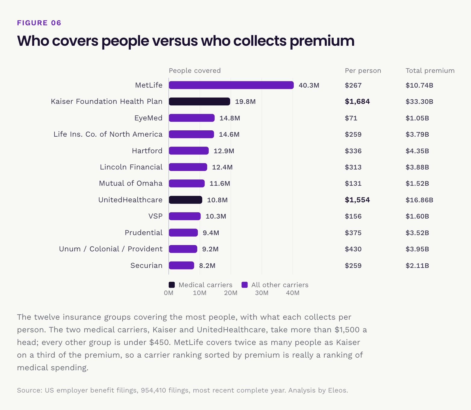
Every insured contract names its carrier. Rank the market by premium and you get the familiar health insurers. Rank it by the number of people covered and a completely different industry shows up.
By people covered
By premium
| # | Insurance group | Premium | Reach | Commission rate |
|---|---|---|---|---|
| 1 | Kaiser Foundation Health Plan | $33.30B | 22.9% | 1.33% |
| 2 | Blue Cross Blue Shield | $19.96B | 14.9% | 2.11% |
| 3 | UnitedHealthcare | $16.86B | 13.8% | 1.89% |
| 4 | Cigna | $12.50B | 13.2% | 2.29% |
| 5 | MetLife | $10.74B | 14.7% | 3.58% |
| 6 | Aetna | $10.37B | 6.5% | 1.74% |
| 7 | Anthem / Elevance | $6.01B | 5.7% | 2.16% |
| 8 | Hartford | $4.35B | 7.4% | 3.79% |
| 9 | Unum / Colonial Life / Provident | $3.95B | 14.3% | 7.77% |
| 10 | Lincoln Financial | $3.88B | 8.8% | 5.69% |
| 11 | Life Insurance Company of North America | $3.79B | 7.1% | 3.90% |
| 12 | Prudential | $3.52B | 3.6% | 3.95% |
"Reach" means the share of employers with an insured contract on file who name that insurance group. Groups roll up subsidiaries and brands. Premium excludes contracts where reported commission or fees came to more than half the premium, a keying error screen that removes 3,574 rows.
Put the two rankings next to each other and the structure of the market falls out:
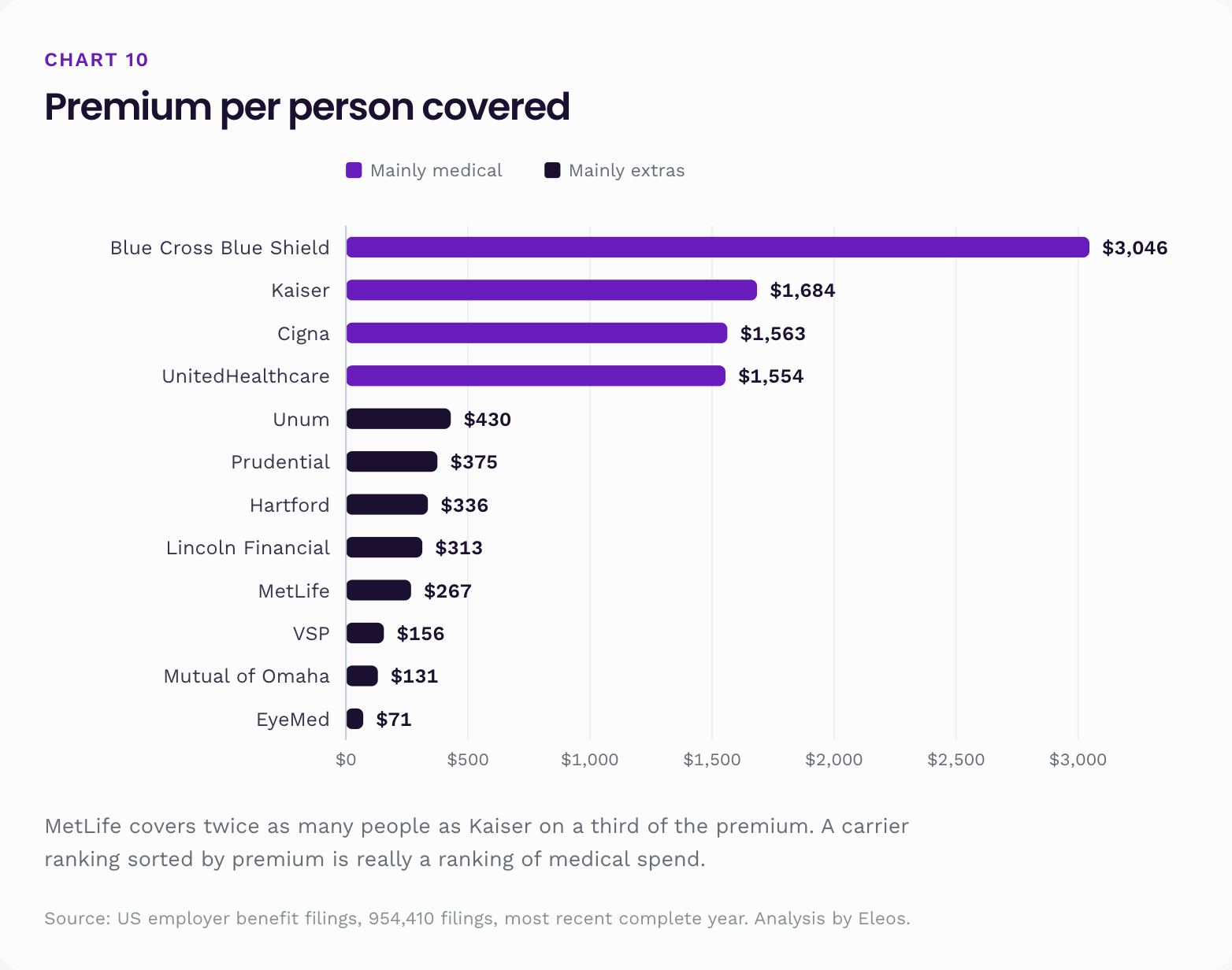
MetLife covers twice as many people as Kaiser on a third of the premium. EyeMed covers 14.8 million people for $1.05 billion, about $71 a head. These are not small companies pretending to be big. They are a genuinely different business, selling many cheap contracts to many employers instead of a few expensive ones.
There is a lesson here for anyone reading benefits league tables. A carrier ranking sorted by premium is really a ranking of medical spending. It tells you almost nothing about who protects the most people, and nothing at all about who writes the life and disability cover that the rest of this report identifies as the scarce thing.
Who writes group life and disability insurance
Pull out the carriers whose book is overwhelmingly non-medical and the specialist tier becomes visible:
| Insurance group | Premium | Share non-medical |
|---|---|---|
| MetLife | $10.74B | 94.5% |
| Hartford | $4.35B | 99.4% |
| Unum / Colonial Life / Provident | $3.95B | 99.4% |
| Lincoln Financial | $3.88B | 99.7% |
| Life Insurance Company of North America | $3.79B | 95.1% |
| Prudential | $3.52B | 99.6% |
| Guardian | $2.49B | 99.3% |
| Securian | $2.11B | 100.0% |
| Sun Life | $2.07B | 98.6% |
| Voya / ReliaStar | $1.68B | 98.4% |
| Mutual of Omaha | $1.52B | 99.1% |
Eleven carriers, roughly $40 billion of premium, almost none of it medical. Across every contract on file, non-medical premium comes to about $54.9 billion against $116.6 billion of medical. So these eleven alone hold roughly three quarters of the non-medical market, and that market runs at about half the size of the medical one sitting beside it.
Guardian is worth singling out. Only Kaiser reaches more employers, and Blue Cross Blue Shield ties it, on $2.49 billion of premium against Kaiser's $33.30 billion. Guardian's 10.84% commission rate is among the highest of any large carrier, which is what it costs to distribute a lot of small contracts to a lot of separate employers.
Part 7. Top brokers
Between the insurer and the employer sits a broker, and the filings name them. Each insured contract discloses who was paid commission or fees, which makes this the clearest public view there is of which brokers actually serve America's largest employers. Normalised and ranked by reach, meaning the share of employers with a broker named who name each firm:
| # | Broker | Reach | Commission | Fees | Per employer reached |
|---|---|---|---|---|---|
| 1 | Marsh McLennan Agency | 8.8% | $368.5M | $106.0M | $96,134 |
| 2 | USI Insurance Services | 7.6% | $228.4M | $70.9M | $70,071 |
| 3 | Gallagher | 6.7% | $292.0M | $69.3M | $95,987 |
| 4 | Lockton | 5.4% | $310.4M | $87.1M | $130,063 |
| 5 | HUB International | 5.2% | $196.3M | $40.7M | $81,218 |
| 6 | Mercer | 3.9% | $315.8M | $68.5M | $172,725 |
| 7 | Brown & Brown | 3.3% | $97.9M | $26.6M | $67,058 |
| 8 | Alliant Insurance Services | 3.2% | $140.6M | $34.7M | $97,727 |
| 9 | Willis Towers Watson | 3.1% | $219.8M | $66.6M | $162,013 |
| 10 | OneDigital | 3.1% | $101.8M | $33.4M | $76,631 |
| 11 | Aon | 2.3% | $134.4M | $51.9M | $143,325 |
| 12 | NFP | 2.1% | $65.1M | $15.7M | $69,703 |
The two dimensions tell different stories, and the best comparison sits inside a single company. Marsh McLennan Agency and Mercer share a parent. Marsh McLennan Agency reaches 8.8% of the brokered market at about $96,000 of disclosed pay per employer. Mercer reaches 3.9% at about $173,000. One is a broad middle market book, the other a large account consultancy. Together the two are named on roughly 12.6% of all filings that name a broker.
Below the top of the table:
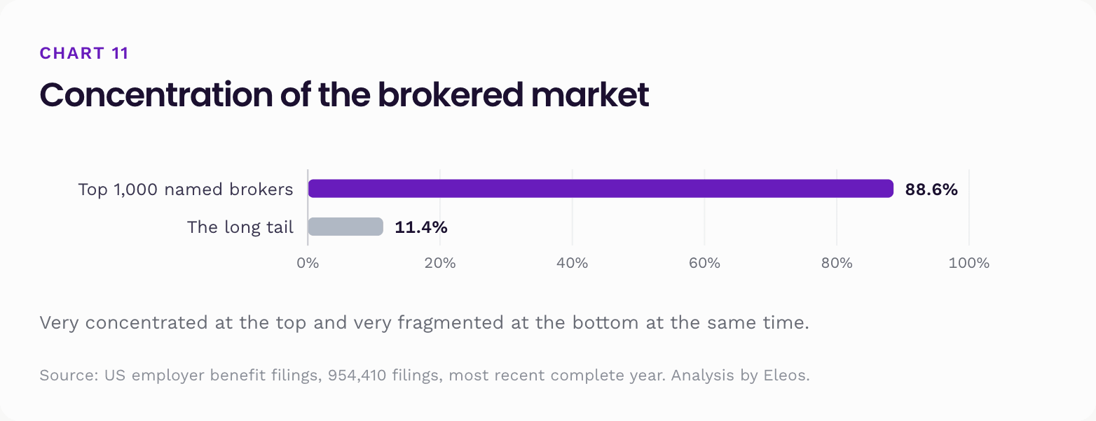
The top 1,000 named brokers appear on 88.6% of filings that name anyone. Below them sits a long tail of local agencies writing one or two contracts each, most visible in small group business. Benefits distribution in America is very concentrated at the top and very fragmented at the bottom at the same time.
These are named recipients of commission and fees on employer filings, not a broker of record register. A named recipient can be a general agent, a wholesaler or a consultant rather than the employer's own adviser.
What distribution costs
So far this part has priced the benefits themselves. The other cost in the chain is distribution: what the insurer pays to have the contract sold. The filings disclose it, and it varies by benefit far more than the premiums do.
Commission as a share of premium, by the main benefit on each contract:
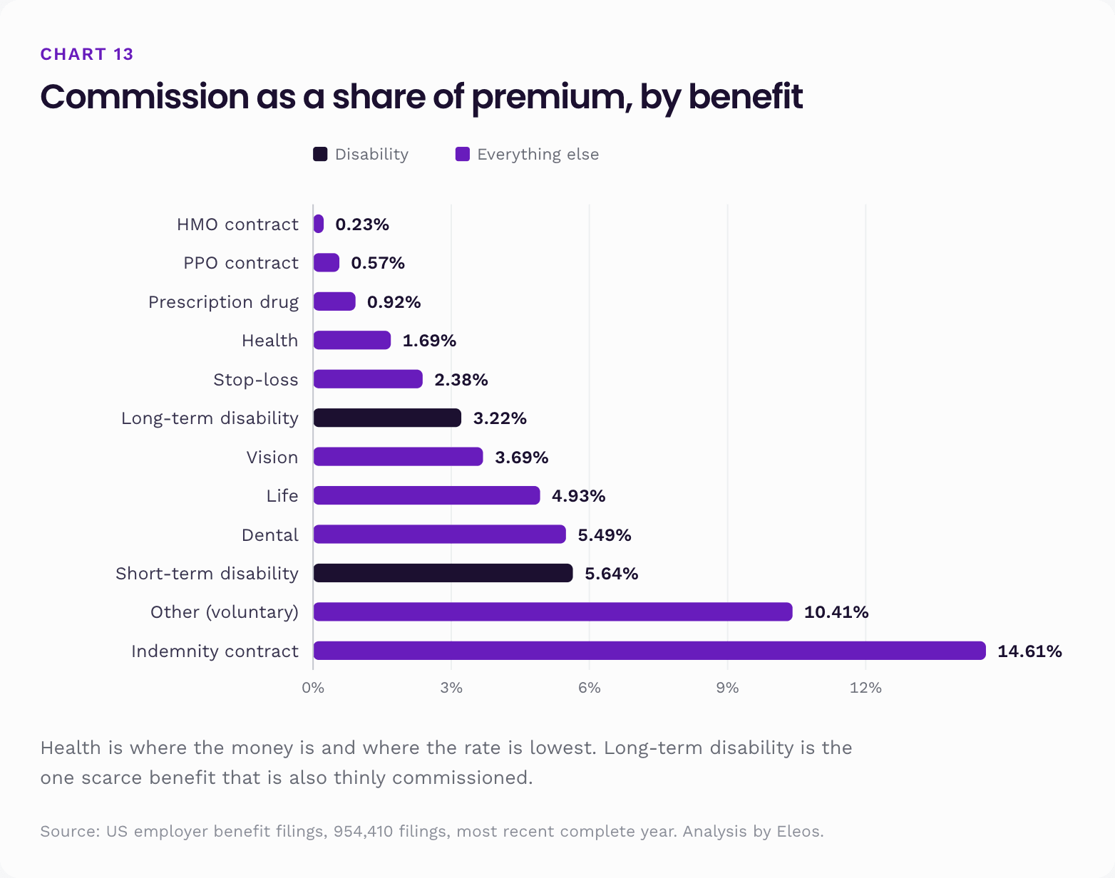
Across everything, $4.89 billion of commission and $1.56 billion of fees were disclosed on $171.5 billion of premium. That is 2.85% and 0.91%.
One rate looks wrong until you check the dollars behind it. Long-term disability pays 3.22% against short-term disability's 5.64%, which reads as brokers being paid far less to place the scarcer benefit. They are not. Commission per contract is almost identical: $13,241 on long-term against $13,683 on short-term. What differs is the denominator. The average long-term contract carries $411,050 of premium against $242,767 for short-term, 1.69 times as much, because long-term contracts cover a wider slice of a plan's people. The same cheque on a bigger base is a smaller percentage.
There is a broader economic point here too. Health is where the money is and where the rate is lowest. Most of the extras carry rates two to three times higher, because they cost about the same to sell on a fraction of the premium. Long-term disability is the exception at 3.22%, which makes it the one scarce benefit that is also thinly commissioned. Broadly though, the benefits an employer is most likely to skip are the ones a broker earns the most on as a percentage, and the least on in actual dollars. A 5.49% commission on a $421 a head dental contract is a smaller cheque than a 1.69% commission on a $6,347 a head medical one. Nothing in the economics of distribution pushes hard toward closing the gap this report describes.
Part 8. What it all means
Six conclusions, in order of how confident we are.
1. Benefits get bought by visibility, not by consequence
The reliability ladder, dental then life then vision then some disability then both, is almost exactly an ordering by how often an employee notices the benefit. Dental gets used twice a year by everybody. Vision produces a pair of glasses. Life pays once, to somebody else. Disability pays to a small minority, after a waiting period, through a claims process most employees have never thought about.
The link to cost is not weak so much as absent: across the five extras, the rank correlation between price and adoption is −0.10. Vision is the cheapest benefit on the sheet and sits third; dental is the dearest and sits second. The link to severity is strongly negative. The benefits that matter most to a household in the worst year of its life are the ones least likely to be on file. Benefits packages seem to get built the way a recruiting brochure gets written, from the top of mind down.
2. The gap is a buying decision, and the funding data proves it
Self-funding could have explained the missing disability benefits away. Maybe employers pay those claims out of their own money and file nothing. The funding split rules that out. 97.7% of long-term disability and 94.8% of life are placed with an insurer. These are exactly the risks nobody keeps on their own books, because one claim can run for decades. So when a filing shows no long-term disability, the near certain reading is that nobody bought it.
Compare health, where 55.4% shows no insurer, and a missing carrier just means self-funding rather than absence. The conclusion we are willing to draw for disability is one we would refuse to draw for medical.
3. Part of the disability gap is the state, not the employer
The five state finding is the strongest structural result in the report. California, Hawaii, New Jersey, New York and Rhode Island all run public short-term disability schemes, and all five have both disability benefits 54.9% of the time against 69.4% elsewhere, while having more dental than the rest of the country. That is a specific shortfall, in exactly the spot a public programme sits, with no matching drop in the benefits the state does not provide.
So the honest reading of the national 66.3% is this: a meaningful slice of the shortfall is public cover standing in for private cover, and the rest is genuinely uncovered. Anyone quoting a national disability figure without that adjustment is overstating the private gap in five states and understating how stark it is in the other 46.
4. Physical risk and income protection move in opposite directions
Construction, transportation, agriculture, nursing care, waste management, motor vehicle dealers. The parts of the economy where work gets done with the body cluster at the wide end of the protection gap and the bottom of the ranking. Technology, professional services, publishing and banking cluster at the other end.
We cannot show cause from filings alone, and some of this is tangled up with pay, tenure, unionisation and how sophisticated the HR function is. But the direction is not ambiguous, and it is the most uncomfortable pattern in the data. Being exposed to the risk of losing your ability to work is negatively correlated with having documented insurance against it.
5. Scale buys competence quickly, then stops
The size ladder flattens above 200 participants. A mid-sized employer already behaves a lot like a very large one, 83.7% against 88.4% on the full package, and both disability benefits is flat across the top two bands rather than still climbing. So the advantage large employers hold is not mainly about buying power. It is about having somebody whose job is to think about this. That threshold gets crossed early, and once it is crossed, more scale adds very little.
For an employer sitting below it, that is encouraging. The gap between you and a Fortune 500 benefits package is a decision, not a budget.
6. Nothing in the distribution chain pushes toward closing the gap
Commission rates on the extras are high as percentages and small in dollars. The carriers that write life and disability are a specialist tier holding about $54.9 billion of premium against $116.6 billion of medical. The brokers with the widest reach earn most of their disclosed pay from the medical line. Meanwhile employers weigh a $263 long-term disability benefit against a $6,347 medical benefit in the same renewal meeting, in the same week, with the same finance director.
The result is a market where the cheap, catastrophic risk products are structurally under sold. Not through anyone's bad faith, but because every incentive in the chain is proportional to premium, and premium lives in medical.
What this is not
Three claims this data cannot support, worth stating plainly because they are the ones most likely to be read into it:
- It is not a measure of generosity. A code says a benefit exists on a filing. It says nothing about the salary multiple, the waiting period, the definition of disability, who pays the premium, or how many employees are eligible. Two filings that both say "long-term disability" may describe wildly different products.
- It is not a measure of enrolment. Having a benefit is not the same as employees taking it. Voluntary benefits in particular can have low take up.
- It is not a census. Small plans are largely exempt, benefits filed by union trusts or separate entities may not appear under the employer's name, and the snapshot was taken while a small number of late filings for the year were still arriving.
What it means for you
If you run a benefits programme, this report gives you an unusually cheap diagnostic. Pull your own filing and read the benefit codes down the page.
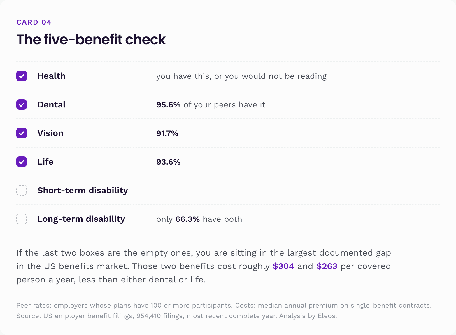
Three practical points follow from the data rather than from opinion.
Benchmark against your own sector, not the national average. A construction firm at 70% is sitting at its sector median. A software firm at 70% is far behind its peers. The national 80.8% is a poor target for anybody.
If you are in one of the five state programme states, check what you are actually relying on. State disability programmes have caps and time limits that may sit well below what your employees would need. This data cannot tell you whether the public benefit is enough for your workforce. It only tells you that employers in those states have largely stopped buying private cover alongside it.
The marginal cost of closing the gap is small and known. Median standalone pricing puts both disability benefits at about $567 per covered person per year combined, roughly 9% of the median health benefit. That is the actual size of the decision.
If you are an employee
A five person shop is not in this data, and none of this is a verdict on any particular job. But it is a reliable read on what most people's workplace cover looks like, and it points to a specific question worth asking.
Among employers with 100 or more plan participants, dental, vision and life each show up more than nine times out of ten. Some form of disability cover shows up 87.4% of the time. Both benefits show up two thirds of the time. About 6.4% of packages have dental, vision and life but no disability benefit whatsoever.
So when somebody hands you a benefits summary, the dental and vision pages are near certain to be there and are the least consequential. The pages worth finding are the ones about what happens when you cannot work:
- Is there short-term disability, for how long, and at what percentage of salary?
- Is there long-term disability, when does it start, and does it define disability as being unable to do your job or any job?
- Is the life cover a flat amount or a multiple of salary, and does it survive you leaving the job?
If you live in California, Hawaii, New Jersey, New York or Rhode Island, part of the short-term answer may come from the state rather than your employer. It is worth knowing which, and worth knowing the cap.
The clearest pattern across 954,410 filings is that employers insure teeth more reliably than paychecks. Dental is in 95.6% of packages. Both disability benefits are in 66.3%. The benefits that decide a sector's ranking are life and disability, and they are also the benefits that decide whether a household stays standing after a bad diagnosis.
Eleos builds income and life protection that can sit alongside an employer plan or stand on its own.
- Term life for the people a paycheck supports, quoted online.
- Income protection, where available, that replaces earnings when illness or injury stops you working, whether or not your employer offers a disability benefit.
- Plain explanations of what a workplace plan covers and where the gaps usually are.
If you are not sure what your employer plan includes, start with the five benefit check above. Health, dental, vision, life and disability are listed separately on the filing, and the one that is missing is usually the one to ask about.
Methodology
Filing year. The most recent complete filing year is plan year 2024, and that is the year this report covers throughout. Plan year 2025 filings are still arriving and are not used here.
Source. Public employer benefit filings (Form 5500 and schedules): 954,410 filings, of which 949,478 come from the 50 states and DC. Snapshot collected through April 2026. It is a comparison base, not a census of every filing that will eventually arrive.
Filing threshold. Welfare benefit plans with fewer than 100 participants at the start of the plan year are generally exempt from filing when they are insured, unfunded, or a combination of the two. Plans at or above 100 participants file. That is why this report treats 100 participants as its floor.
Benefit codes. The Form 5500 benefit codes read here are 4A health, 4B life, 4D dental, 4E vision, 4F temporary disability and 4H long-term disability. The form's own label for 4F is "temporary disability"; this report calls it short-term disability throughout, which is what employers and insurers call the same benefit.
Base construction. One record per employer identification number whose filings include a health plan (code 4A). The largest health filing by beginning of year participants sets that record's state, business code, plan type and size band. Benefit codes are combined across all of the employer's returns, so a benefit filed on a separate form still counts.
Two bases. All health plan records, and the subset whose largest health plan has 100 or more participants (54,147 records, covering 72.1 million participants). The 100 plus base carries every headline in this report.
Intervals. Wilson 95% intervals, treating records as a sample drawn from a larger notional population of comparable employers. They describe sampling noise only. They do not describe the selection built into who has to file, keying error in the filings themselves, or benefits that exist but are filed by another entity, and those are the larger sources of uncertainty in this report. Two groups whose intervals overlap are not treated as different.
Sectors and industries. The 96 business codes on the filings map to 29 fixed sectors (manufacturing split three ways, health care three ways, retail two ways, with technology, hospitals and nursing kept separate). Every classified record belongs to exactly one sector. 22,301 records carry no business code and are excluded from sector tables. Industry tables use a floor of 100 records on the 100 plus base.
The protection gap. Defined as the share with both dental and vision, minus the share with both life and at least one disability benefit. Both parts are measured on the same base, so the difference is a like for like comparison of two benefit families.
Insurers and brokers. Contract rows joined to their exact filing, with parser error rows dropped. Dollar figures exclude contracts whose commission or fees exceed half of premium (3,574 rows). Insurers are keyed by regulator code or normalised name and rolled up to parent brands. Brokers are keyed by normalised name with national consolidators rolled up. Commission on contracts with no premium, typically experience rated arrangements, is retained, because a ratio cannot be tested where there is no premium. Reach percentages are shares of the records that have an insured contract, or a named broker, on file.
Screening tables for stability. Where a table ranks groups, rows whose interval is too wide to rank are either excluded or called out. The state cost table applies an explicit screen: at least 100 in-band contracts and a bootstrapped 95% interval no wider than a fifth of the median, computed on a stated band of $500 to $30,000 per covered person over 4,000 resamples. Twenty states clear it. The percentage tables show an interval on every row, so nothing is dropped there, but rows with intervals wider than 10 points are named as unrankable.
Per covered person. Single benefit contracts only. Total premium (employer and employee contributions combined) divided by the number of persons covered as reported by the carrier on Schedule A line 1(e), with benefit specific plausibility bands and out of band rows dropped. This is not a per employee figure and not a per household figure. Compared against participant counts on the same filings, the median ratio of persons covered to plan participants is 0.77 for health, 1.00 for dental, 0.84 for vision, 0.88 for life, 0.90 for long-term disability and 0.61 for short-term disability, with a wide spread in each case (the middle half of health contracts runs 0.29 to 1.17). The filings carry no breakdown of employee against spouse against child.
Funding. Read from each filing's own funding arrangement checkboxes, for 54,081 readable filings on the 100 plus base. Blank readings are excluded rather than filled in. The by benefit self-funding shares use the absence of a named insurer for that benefit and are a heuristic, not a checkbox reading.
State programme comparison. California, Hawaii, New Jersey, New York and Rhode Island pooled against the remaining 46 jurisdictions, using record counts rather than an average of state rates, so large states are not under weighted.
Naming. Insurers and brokers are named from what filings disclose. No employer is named for what its filings do not record.
What Benefits Do Big Employers Offer in the US?
Frequently asked questions
Fact-checked and reviewed by Kiruba Shankar Eswaran or another licensed agent on our team. Read our editorial standards.
This guide is for general educational purposes and is not insurance advice. Product features, availability, and amounts vary by state and by policy. Always review the official plan documents for the full terms, limitations, and exclusions before you buy.